Enterprise architecture diagrams serve as the visual backbone for strategic decision-making. When stakeholders navigate complex models, clarity determines effectiveness. ArchiMate provides a standardized language for describing, analyzing, and visualizing enterprise architectures. However, a standard notation alone does not guarantee understanding. Color coding acts as a critical layer of communication, guiding the eye and reinforcing the semantic meaning of architectural elements.
Without a disciplined approach to visual styling, diagrams often become cluttered mosaics of lines and shapes that confuse rather than inform. This guide explores how to implement color coding strategies that enhance readability, reduce cognitive load, and align with industry standards. By treating color as a functional component of the architecture model, teams can create artifacts that are not only accurate but also intuitive.
🧠 The Cognitive Load of Complex Models
When viewing an enterprise architecture diagram, the human brain processes visual information before logical information. The initial scan determines whether a viewer feels overwhelmed or engaged. High cognitive load occurs when a viewer must expend excessive mental effort to decipher relationships or distinguish between similar elements.
Color coding mitigates this load by pre-attentively processing information. This means the brain identifies color differences without conscious effort. When applied correctly to ArchiMate diagrams, color coding allows stakeholders to:
- Instantly identify the type of element (e.g., Process vs. Application).
- Distinguish between layers (Business vs. Technology).
- Recognize the status of an artifact (e.g., Planned vs. Live).
- Trace specific flows without getting lost in connection lines.
Consider a scenario where a diagram contains fifty business processes and fifty application components. If both are rendered in black and white, the viewer must rely solely on shape or text labels to differentiate them. This slows down comprehension. Introducing distinct color palettes creates immediate visual separation, allowing the viewer to focus on relationships rather than identification.
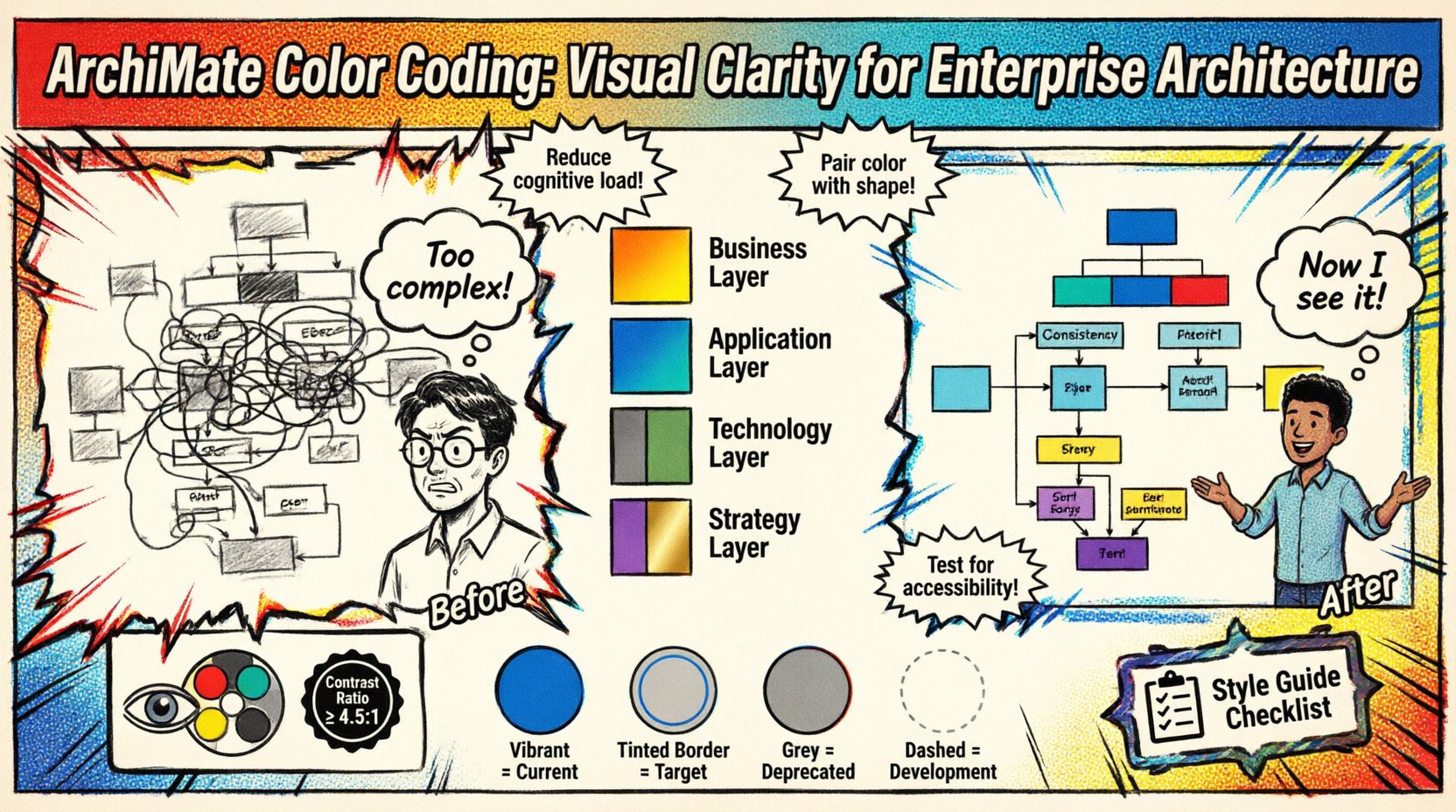
🌈 ArchiMate Standard Color Guidelines
While ArchiMate defines the syntax of the language, it does not mandate specific hex codes for rendering. This flexibility allows organizations to tailor visuals to their brand or specific needs. However, consistency is key. Adopting a consistent palette across all models prevents confusion when switching between diagrams.
Below is a foundational approach to mapping colors to ArchiMate elements based on their inherent nature.
| Element Category | Suggested Color Tone | Reasoning |
|---|---|---|
| Business Layer | Warm Tones (Orange, Yellow, Red) | Represents human activity, energy, and value creation. |
| Application Layer | Cool Tones (Blue, Teal) | Represents systems, stability, and logic. |
| Technology Layer | Neutral Tones (Grey, Green) | Represents infrastructure, hardware, and support. |
| Strategy Layer | Distinct Tones (Purple, Gold) | Represents goals, principles, and high-level direction. |
These are not rigid rules but starting points. The goal is to create a visual language that persists across the entire architecture repository. If the Business Layer is consistently orange, a stakeholder should expect to find business elements in orange regardless of the specific diagram context.
🏗️ Layer-Specific Color Strategies
Enterprise architecture is structured in layers. Color coding can reinforce these boundaries, making it easier to understand the scope of a specific view. When presenting a specific view, such as the Application Layer, using a monochromatic scheme within that layer while keeping other layers muted can highlight the focus area.
1. Business Layer Visualization
The business layer focuses on organizational goals, processes, and organizational units. Colors here should be vibrant to signify human involvement and value.
- Business Processes: Use a solid fill color to represent active workflows.
- Business Roles: Use a lighter shade or outline to represent the actors within the process.
- Business Functions: Use a distinct color to differentiate functions from processes, indicating what is done versus how it is done.
2. Application Layer Visualization
Application components represent software systems. These are generally more static than business processes. A cooler palette helps distinguish them from human-centric elements.
- Application Services: Use a gradient to show service boundaries.
- Application Components: Use solid blocks to represent distinct software units.
- Data Objects: Use a contrasting color to indicate data storage or flow within applications.
3. Technology Layer Visualization
The technology layer supports the application layer. It is often the least visible to business stakeholders but critical for IT operations. Muted colors prevent this layer from visually overpowering the business and application layers.
- System Software: Use grey or muted blue tones.
- Network: Use dotted lines or specific line colors to represent connections without filling the diagram with noise.
- Hardware: Use distinct icons or colors for physical infrastructure nodes.
🚫 Common Pitfalls in Visual Modeling
Even with a good intention, color coding can fail if not managed correctly. Several common mistakes lead to diagrams that are harder to read than those without color.
1. Overuse of Color
Applying a unique color to every single element type creates a rainbow effect that overwhelms the viewer. The goal is differentiation, not decoration. If a diagram contains twenty different element types, try to group them into five or six color families. This reduces the visual noise.
2. Inconsistent Shading
Using different shades of the same color for the same element type creates ambiguity. Is this process the same as that process? No, they are different shades. To avoid this, define a strict palette. If a Business Process is “Process Blue”, every Business Process in the model should be “Process Blue”.
3. Relying Solely on Color
Color should never be the only differentiator. Some stakeholders may have color vision deficiencies. Always pair color coding with shape variations or clear labels. For example, if a Business Process and a Business Application look similar, ensure their shapes differ even if their colors are related.
4. Ignoring Print Context
Diagrams are often printed or exported to PDF. Color printers vary in output quality. A bright yellow might print as white or light grey on some devices. When designing for multi-channel consumption, test colors in grayscale to ensure contrast remains sufficient.
📊 Using Color to Indicate Status and State
Beyond layer identification, color is a powerful tool for indicating the state of an architecture element. This adds a temporal dimension to the static diagram.
- Current State: Use standard, vibrant colors to represent the “As-Is” architecture.
- Target State: Use a slightly different tint or a specific border color to represent the “To-Be” architecture.
- Deprecated/Retired: Use grey or desaturated tones to indicate elements that are being phased out.
- Under Development: Use a dashed border or a distinct highlight color to indicate work in progress.
This approach allows stakeholders to see the transition path without needing a separate diagram for every stage. By overlaying states, the viewer understands the evolution of the architecture at a glance.
♿ Accessibility and Color Blindness
Accessibility is a fundamental requirement for professional architecture documentation. Approximately 8% of men have some form of color vision deficiency. If your diagram relies entirely on red vs. green distinctions, a significant portion of your audience cannot distinguish the data.
To ensure inclusivity:
- Avoid Red/Green Pairs: Do not use these combinations to convey critical differences.
- Check Contrast Ratios: Ensure text color contrasts sufficiently with the background color. WCAG guidelines suggest a minimum contrast ratio of 4.5:1 for normal text.
- Use Patterns: Where possible, combine color with patterns (stripes, dots) to differentiate fills.
- Provide Legends: Always include a legend that explains the color meaning. Do not assume the viewer knows the convention.
Testing your diagrams with color blindness simulation tools is a recommended step before publishing. This ensures that the information remains accessible regardless of the viewer’s visual capabilities.
📋 Governance and Style Guides
Consistency cannot happen by accident. It requires governance. An architecture style guide documents the rules for color usage, ensuring that every modeler follows the same standards.
A style guide should specify:
- Palette Definitions: Exact hex codes for every color used in the model.
- Element Mapping: Which color applies to which ArchiMate element type.
- Layer Rules: Which colors are reserved for which architectural layers.
- View Rules: How to handle colors when filtering views (e.g., should unrelated elements be greyed out or hidden?).
When onboarding new architects, the style guide is a critical resource. It prevents the “snowflake model” problem where every architect creates their own visual language, making the repository difficult to navigate collectively.
🔍 Filtering and View Management
Large models often require views that filter out irrelevant information. Color coding plays a vital role in managing these views. When a user filters a diagram to show only “Application” elements, the color coding should reinforce that focus.
Techniques for view management include:
- Highlighting: Keep the relevant elements in full color and desaturate the irrelevant elements to background grey.
- Hiding: Simply remove irrelevant elements from the canvas to reduce clutter.
- Grouping: Use background shapes or grouping boxes to visually cluster related colored elements together.
This technique allows a single diagram to serve multiple audiences. The “Technical” view shows deep technology details in tech colors, while the “Business” view shows the same diagram with technology elements faded out, leaving business elements prominent.
🔄 Iterative Refinement Process
Color coding is not a one-time setting. It evolves as the architecture evolves. Regular reviews of the diagram styles are necessary to ensure they remain effective.
During model reviews, ask the following questions:
- Is the color palette still intuitive for new stakeholders?
- Are there any elements that blend into the background too much?
- Does the color scheme support the current strategic narrative?
- Are there any inconsistencies that have crept in over time?
Feedback loops are essential. If stakeholders consistently misinterpret a specific color, adjust the palette. The goal is communication, not adherence to an arbitrary rule.
📈 The Impact on Stakeholder Alignment
When diagrams are readable, stakeholder alignment improves. Executives can grasp the high-level strategy without getting bogged down in technical details. Architects can discuss technical debt without losing the business context.
Clear visual communication reduces the time spent explaining basic concepts. This allows meetings to focus on decision-making rather than clarification. It also builds trust in the architecture repository. If the artifacts are well-presented, stakeholders are more likely to trust the information contained within them.
Furthermore, consistent color coding aids in the onboarding of new team members. They can look at historical diagrams and immediately understand the context without needing a lengthy briefing on visual conventions. This accelerates the ramp-up time for new architects and business analysts.
🛠️ Implementation Workflow
Implementing a color coding strategy requires a structured workflow. Follow these steps to establish the practice within your organization.
- Define the Palette: Select a set of colors that align with your brand and meet accessibility standards.
- Map to Standards: Assign colors to ArchiMate element types based on the layer guidelines.
- Configure the Tool: Set up the default styles in your modeling platform to enforce consistency.
- Train the Team: Conduct workshops to explain the rationale behind the colors.
- Audit Models: Periodically check existing models for deviations from the standard.
- Document: Maintain the style guide in a central knowledge base.
This workflow ensures that the color coding is not just a preference but a standardized practice. It moves the visual language from an individual choice to an organizational asset.
🎯 Final Thoughts on Visual Clarity
Diagrams are more than just drawings; they are communication tools. In the context of ArchiMate, the notation provides the grammar, but color provides the emphasis. By investing time in a thoughtful color coding strategy, you improve the utility of your architecture models.
The effort required to maintain a style guide pays dividends in reduced misunderstandings and faster decision cycles. It transforms complex data into actionable insight. As you continue to build your enterprise architecture, remember that every color choice sends a message. Choose them wisely to ensure your message is received clearly.
Start by auditing your current diagrams. Identify areas of confusion. Apply a consistent palette. Measure the difference in stakeholder feedback. Continuous improvement is the hallmark of effective enterprise architecture practice.