


In the complex landscape of system analysis and software development, clarity is paramount. When stakeholders, developers, and analysts attempt to understand how information moves through a system, ambiguity can lead to costly errors. This is where the Data Flow Diagram (DFD) serves as a critical instrument. It provides a structured way to represent the flow of information within a system, separating the logical processes from the physical implementation.
A DFD is not merely a drawing; it is a communication tool. It allows teams to visualize data inputs, transformations, and outputs without getting bogged down in code specifics. By mapping these flows, organizations can identify bottlenecks, ensure data integrity, and align business goals with technical capabilities. This guide explores the mechanics, components, and strategic value of Data Flow Diagrams in modern information systems.
Understanding the Core Purpose 🎯
The primary function of a Data Flow Diagram is to describe what a system does, rather than how it does it. This distinction is vital during the requirements gathering phase. While a code snippet or a database schema shows the implementation, a DFD shows the behavior. It acts as a blueprint for the logic of the system.
Consider a banking application. A flowchart might show the sequence of buttons a user clicks. A DFD, however, focuses on the money moving from the user account to the transaction ledger. It highlights the transformation of data. This abstraction allows analysts to discuss the system’s logic with non-technical stakeholders without introducing confusion.
Why Visualization Matters
- Communication: It bridges the gap between business needs and technical execution.
- Analysis: It reveals missing data points or redundant processes.
- Documentation: It serves as a reference for future maintenance and updates.
- Validation: It helps verify that all data inputs are accounted for and processed correctly.
The Four Essential Components 🧱
Every Data Flow Diagram is constructed from four fundamental building blocks. Understanding these elements is the prerequisite for creating accurate diagrams. Each component has a specific role in the ecosystem of information flow.
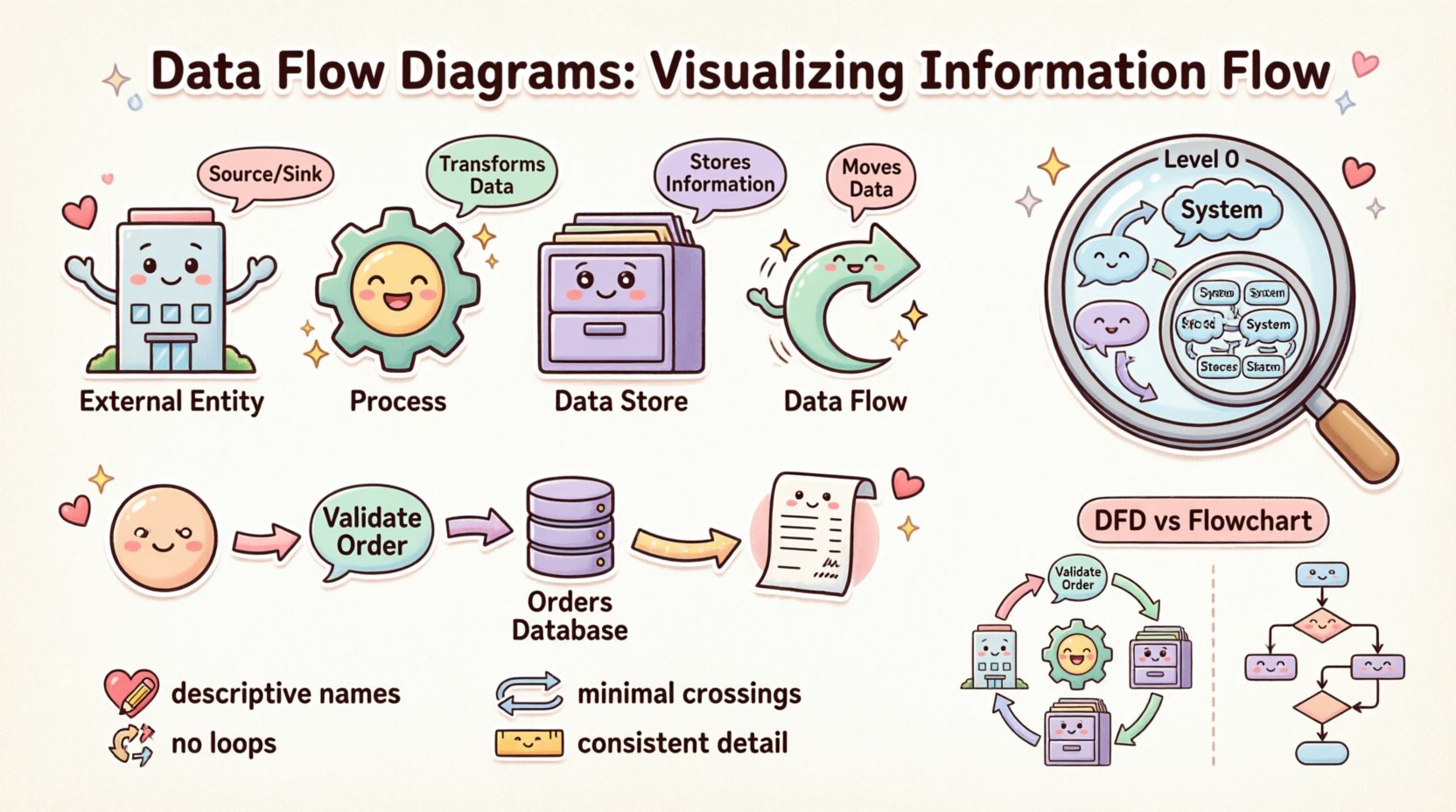
1. External Entities (The Source and Sink) 🏢
External entities represent people, organizations, or other systems that exist outside the boundary of the system being analyzed. They act as the source of data entering the system or the destination where data leaves.
- Terminology: Often referred to as Sources, Sinks, or Actors.
- Function: They initiate a process or receive the final output.
- Example: A Customer, a Bank, a Supplier, or an External Payment Gateway.
2. Processes (The Transformation) ⚙️
Processes represent activities that transform input data into output data. They are the active elements of the diagram. A process changes the state or form of the data.
- Terminology: Also known as Functions or Transformations.
- Function: It takes data in, modifies it, and sends it out.
- Example: “Calculate Tax,” “Validate User Login,” or “Generate Invoice.”
3. Data Stores (The Memory) 🗄️
Data stores represent places where information is held for later use. They do not initiate action but retain data within the system boundary. This could be a physical database, a file, or even a physical filing cabinet in legacy contexts.
- Terminology: Databases, Files, Repositories, or Queues.
- Function: Storage and retrieval of data.
- Example: “Customer Database,” “Order History Log,” or “Inventory File.”
4. Data Flows (The Movement) 🔄
Data flows indicate the movement of information between entities, processes, and stores. They are the connectors that bind the diagram together. A flow must have a name that describes the information being moved.
- Terminology: Arrows, Streams, or Lines.
- Function: Transporting data from point A to point B.
- Direction: Flow is directional. An arrow pointing from a Process to a Store indicates writing data; an arrow pointing from a Store to a Process indicates reading data.
Comparing the Components
To ensure clarity, it is helpful to contrast these components side-by-side. This table outlines the distinct roles each element plays in the diagram structure.
| Component | Role | Notation Shape | Question Answered |
|---|---|---|---|
| External Entity | Source/Sink | Rectangle | Who or What interacts with the system? |
| Process | Transformer | Circle or Rounded Rectangle | What work is being done on the data? |
| Data Store | Repository | Open Rectangle | Where is data kept? |
| Data Flow | Transporter | Arrow | How does data move? |
Levels of Abstraction 📉
A single diagram rarely captures the complexity of an entire system. To manage this complexity, DFDs are created at different levels of detail. This technique is known as decomposition. It allows analysts to zoom in and out of the system architecture.
Context Diagram (Level 0) 🌍
The Context Diagram is the highest level view. It shows the entire system as a single process. It defines the boundaries of the system and identifies all external entities interacting with it. This diagram answers the question: “What is the system’s overall purpose?”
- Scope: One central process.
- Detail: Minimal. Only major inputs and outputs are shown.
- Goal: Define system boundaries for stakeholders.
Level 1 Diagram (Major Processes) 🔍
Once the context is established, the central process is exploded into major sub-processes. This Level 1 diagram breaks the system down into its primary functional areas. It shows how data moves between these major components and external entities.
- Scope: 3 to 7 major processes.
- Detail: High-level internal interactions.
- Goal: Understand the major functional modules.
Level 2 Diagram (Detailed Processes) 🔬
Further decomposition occurs at Level 2. Specific processes from Level 1 are broken down into more granular steps. This is where the logic becomes specific. It is often used for development teams to understand exact requirements for coding.
- Scope: Detailed sub-processes.
- Detail: Specific data transformations.
- Goal: Guide implementation and logic design.
The Concept of Balancing ⚖️
A critical rule in DFD creation is Balancing. The inputs and outputs of a parent process must match the inputs and outputs of its child diagram (the next level down). If a Level 1 process receives “Order Data,” the Level 2 breakdown of that process cannot simply disappear that data; it must still accept “Order Data” as an input.
Violating balancing rules creates inconsistencies in the system model. It suggests data is being created out of thin air or disappearing without a trace. Maintaining balance ensures that the logical integrity of the system is preserved across all levels of abstraction.
Data Flow Diagrams vs. Flowcharts 🆚
It is a common mistake to confuse Data Flow Diagrams with Flowcharts. While they share a visual similarity, their intent and structure differ significantly.
- Flowcharts: Focus on control flow. They show the sequence of steps, decisions, and loops. They answer “What happens next?” They are often used to describe the logic of a specific algorithm or user interface interaction.
- Data Flow Diagrams: Focus on data flow. They show the movement of information. They answer “Where does the data go?” They do not typically show loops or decision points explicitly; they show transformations.
Using the wrong diagram type can confuse the development team. If you need to document a user login sequence with error handling, a Flowchart is better. If you need to document how user data moves from the form to the database, a DFD is appropriate.
Best Practices for Clarity ✨
Creating a DFD is an exercise in discipline. Following established conventions ensures the diagram remains readable and useful over time.
1. Naming Conventions 📝
Labels must be descriptive. Avoid vague terms like “Process 1” or “Data A.” Instead, use verb-noun combinations for processes, such as “Validate Password.” For data flows, use nouns that describe the content, such as “Shipping Address” or “Payment Receipt.” Consistent naming helps users navigate the diagram without guessing.
2. Avoiding Data Flow Loops 🚫
A data flow should not loop back to the same process immediately. While data can return to a process after passing through other components, direct self-loops often indicate a logical error or a misunderstanding of the process boundary. A process should take input, transform it, and output it. If it outputs directly back to itself, it implies infinite processing.
3. Minimizing Crossings 🧵
A cluttered diagram is a useless diagram. Arrange the components so that data flows naturally, typically from left to right or top to bottom. Minimize the number of arrow crossings. If lines cross, it becomes difficult to trace the path of specific data. Use curves or breaks to maintain visual flow.
4. Consistent Granularity 📏
Within a single diagram, the level of detail should be consistent. Do not mix high-level processes with low-level sub-processes. If one process is broken down into three steps, all other major processes in that same view should be at the same level of decomposition.
Common Pitfalls and Solutions ⚠️
Even experienced analysts encounter errors when constructing diagrams. Recognizing these common pitfalls can save time during the review process.
The Black Hole
A Black Hole occurs when a process has inputs but no outputs. Data enters the process and vanishes. This usually indicates a missing data store or a missing flow to an external entity. Every process that accepts data must produce some result.
The Miracle Process
This is the opposite of a black hole. A Miracle Process has outputs but no inputs. It generates data without consuming any information. This is physically impossible. Every output must be derived from some input data.
Ghost Data
Ghost Data refers to data flows that are implied but not drawn. If a process needs a customer ID to function, but no arrow brings the ID into the process, the logic is incomplete. Every data requirement must be explicitly connected.
External Entity Confusion
Analysts sometimes mistake internal components for external entities. If a component is part of the system boundary, it is a process or a store. If it is outside the system, it is an entity. Drawing a boundary line helps clarify this distinction.
Integration into the Development Lifecycle 🛠️
Data Flow Diagrams are not static artifacts; they are living documents that evolve with the project. They play a role in various stages of the software development lifecycle.
- Requirements Gathering: DFDs help capture user needs by visualizing how data enters and leaves the business. They validate that all required data points are identified.
- System Design: They guide database design. Data stores in the DFD translate directly into tables or collections in the database schema.
- Testing: Test cases can be derived from the data flows. If a flow exists in the diagram, it must be tested to ensure data integrity.
- Maintenance: When changes occur, the DFD is updated. It provides a high-level overview that helps new team members understand the system quickly.
The Psychology of Visualization 🧠
Why do we rely on diagrams instead of text? The human brain processes visual information significantly faster than text. A DFD leverages spatial reasoning to organize complex logic. It allows the viewer to see relationships that might be lost in a paragraph of text.
When stakeholders see the diagram, they can spot missing connections instantly. A gap in the arrows is more visible than a gap in a requirements document. This visual immediacy reduces the risk of misinterpretation. It creates a shared mental model among the team.
Future of Data Visualization 🔮
As systems become more distributed and cloud-native, the role of the DFD remains relevant. Modern systems involve microservices, APIs, and third-party integrations. These are essentially external entities and data flows.
Automated documentation tools are beginning to generate DFDs from code repositories. While these tools are useful for maintaining consistency, manual review is still necessary to ensure the logical correctness of the flow. The core principles of decomposition and balancing remain constant, regardless of the technology stack.
Summary of Strategic Value 💡
Data Flow Diagrams provide a structured approach to understanding information systems. They break down complexity into manageable components. They facilitate communication between technical and non-technical teams. They serve as a foundation for database design and process optimization.
By adhering to the principles of balancing, clear naming, and appropriate abstraction, analysts can create diagrams that stand the test of time. Whether building a new application or auditing an existing one, the DFD remains a fundamental tool for visualizing the flow of information. It turns abstract logic into a concrete map that guides development and ensures alignment with business objectives.
When you next approach a system analysis task, remember that clarity is the goal. Use the DFD to map the journey of your data. Ensure every piece of information has a source, a destination, and a path. This discipline will result in more robust systems and fewer misunderstandings.