In modern software engineering, systems rarely exist as monolithic entities. They are composed of multiple services, processes, and storage units that interact across network boundaries. Understanding how information moves between these distinct units is critical for maintaining system integrity, diagnosing failures, and planning for scalability. This guide explores the process of mapping and visualizing data flow within distributed architectures, specifically utilizing the C4 model as a structural framework.
Without clear documentation, distributed systems quickly become black boxes. Engineers struggle to trace requests, identify bottlenecks, or understand the impact of changes. Visualizing the movement of data provides clarity. It transforms abstract logic into concrete diagrams that stakeholders can interpret. This document outlines the methodologies for defining boundaries, mapping connections, and maintaining these diagrams over time.
1. The Architecture Landscape 🌍
Distributed systems introduce complexity that monolithic applications do not face. When a single process handles all logic, data flow is internal and linear. When multiple containers or services are involved, data traverses networks, passes through firewalls, and crosses trust boundaries. Each hop introduces latency and potential points of failure.
Visualizing this landscape requires a standardized approach. Ad-hoc diagrams often lead to inconsistency. One engineer might draw a database as a cylinder, while another uses a box. Standardization ensures that when a diagram is viewed, its meaning is immediately understood. The C4 model provides this standardization by defining specific levels of abstraction.
Key challenges in distributed visualization include:
- Network Latency: Visualizing where data waits in queues or networks.
- Data Consistency: Showing how state is synchronized across nodes.
- Failure Domains: Identifying what happens if one container stops responding.
- Security Boundaries: Marking where data encryption or authentication is required.
2. The C4 Model Explained 📐
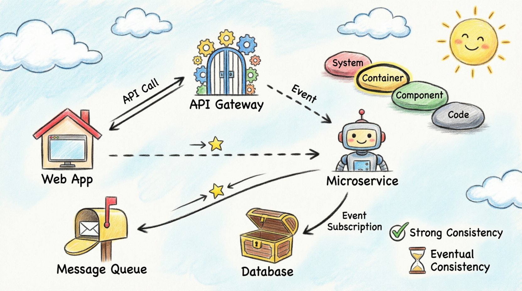
The C4 model is a hierarchy of diagrams used to describe software architecture. It consists of four levels, each serving a different audience and purpose. For data flow visualization across containers, the Container and Component levels are the most relevant.
Level 1: System Context
This high-level view shows the system as a single block and its interactions with external users and systems. It answers the question: “What does this system do, and who uses it?” While useful for context, it does not show internal data flow between containers.
Level 2: Containers
This is the core of distributed visualization. A container represents a distinct unit of deployment. Examples include web applications, mobile apps, microservices, and data stores. This level illustrates how data flows between these units. It is the ideal place to map API calls, message queues, and direct database connections.
Level 3: Components
Within a container, components represent distinct parts of the software. This level dives deeper into the logic, showing internal class interactions or module dependencies. While important, it is often too detailed for high-level data flow analysis.
Level 4: Code
This level maps to specific classes and methods. It is generally unnecessary for architectural flow documentation and is better suited for developer-specific reference materials.
3. Identifying Container Boundaries 🚧
Before drawing data flow lines, you must define what constitutes a container. A container is a deployable unit. It has a lifecycle independent of other containers. It may run on the same physical server or be distributed across different regions.
Common container types include:
- Web Applications: Frontend interfaces accessed via browsers.
- Microservices: Backend services handling specific business logic.
- API Gateways: Entry points that route traffic to internal services.
- Data Stores: Databases, caches, or file systems.
- Batch Processes: Scheduled jobs that process data asynchronously.
When defining boundaries, consider the deployment strategy. If two services are always deployed together and share memory, they may be part of a single container. If they can be scaled independently, they should be separate containers. This decision impacts how data flow is visualized.
4. Mapping Data Flow Patterns 📡
Data flow is not merely a line connecting two boxes. It represents a specific interaction pattern. Understanding the pattern is crucial for accurate visualization. The following table outlines common patterns and how they should be represented.
| Pattern | Direction | Visibility | Use Case |
|---|---|---|---|
| Synchronous Request/Response | Two-way (Client → Server → Client) | Immediate | API calls, Form submissions |
| Asynchronous Fire-and-Forget | One-way (Client → Server) | Deferred | Logging, Analytics events |
| Pull-Based Processing | One-way (Worker ← Queue) | On Demand | Background jobs, Data ingestion |
| Event Subscription | One-way (Publisher → Subscriber) | Event Triggered | Notifications, State changes |
Synchronous Communication
In synchronous flows, the sender waits for a response. This is common in API interactions. When visualizing this, use solid lines with arrowheads indicating the request and the response. Label the protocol used, such as HTTP or gRPC. This helps engineers understand the blocking nature of the interaction.
Asynchronous Communication
Asynchronous flows decouple the sender from the receiver. The sender places a message in a queue and continues. The receiver processes the message later. Visualize this using dashed lines or distinct icons to represent the message broker. It is vital to indicate the queue name to distinguish between different streams of data.
5. Handling Synchronization and Consistency ⚖️
One of the most difficult aspects of distributed data flow is state management. When data is written to one container, does it immediately reflect in another? Visualization must capture these consistency requirements.
Strong Consistency
Some systems require that all nodes see the same data at the same time. This often implies a single source of truth or synchronous replication. In diagrams, mark these connections with labels indicating “Strong Consistency” or “ACID”. This alerts stakeholders that downtime in one part of the system may affect others.
Eventual Consistency
Many distributed systems prioritize availability over immediate consistency. Data may take seconds or minutes to propagate. Visualize this by adding a time indicator or a “Sync” label with a delay notation. This manages expectations regarding when users will see updated information.
Stateless vs. Stateful Containers
Stateless containers do not store data locally. They rely on external databases or caches. Stateful containers hold data within their own storage. When mapping flow, ensure external storage is clearly separated from the container. If a container stores data, the flow line should point to a storage icon within or attached to that container.
6. Documentation Maintenance 📝
A diagram is only useful if it is accurate. Over time, code changes, new services are added, and deprecated services are removed. Static diagrams become obsolete quickly. A strategy for maintenance is required.
Best practices for keeping documentation current include:
- Automated Generation: Where possible, generate diagrams from code annotations or configuration files. This reduces manual effort and prevents drift between code and docs.
- Review Cycles: Include diagram updates in the definition of done for pull requests. If a service interface changes, the diagram must change.
- Versioning: Treat architecture diagrams as code. Store them in version control systems to track history and enable rollback if a change is incorrect.
- Tooling Standards: Use a consistent tooling stack. Avoid switching between different diagramming platforms for different teams.
7. Common Pitfalls to Avoid 🛑
Even with a structured approach, errors can occur during the visualization process. Being aware of common mistakes helps maintain high-quality documentation.
Over-Abstraction
It is tempting to simplify diagrams too much. If you group ten services into a single box labeled “Backend”, you lose the ability to trace specific data paths. Maintain the granularity of the Container level. Do not merge distinct deployment units unless they share the exact same lifecycle.
Ignoring Failure Paths
Most diagrams show the happy path where everything works. A robust visualization also indicates failure modes. Where does the flow go if a service times out? Is there a fallback service? Is there a dead-letter queue? Adding these paths makes the diagram a tool for resilience planning.
Inconsistent Naming
Use the same terminology for services in the diagram as in the codebase. If a service is called “Order-Service” in the code, do not label it “Orders API” in the diagram. This creates confusion during debugging sessions.
Missing Data Types
A line between two containers tells you *that* data moves, but not *what* data moves. It is helpful to annotate the lines with the data payload type. For example, “JSON Payload”, “Binary Image”, or “CSV Batch”. This informs engineers about the complexity of processing required at the receiving end.
8. Best Practices for Maintenance and Growth 📈
As the system grows, the diagram can become cluttered. Managing complexity is an ongoing task. Here are strategies to keep the visualization clean and useful.
- Layering: Use different layers for different concerns. One layer for security, another for data flow, and a third for deployment topology. Avoid drawing all of these on a single page.
- Links to Details: If a container is complex, create a separate sub-diagram for it. Link the main diagram to the detailed view rather than drawing every component on the overview page.
- Color Coding: Use color to indicate status or criticality. Red for critical paths, blue for standard flows, and grey for deprecated connections. This allows for quick visual scanning of the system health.
- Metadata: Include the version of the diagram and the date of the last review in the footer of the document. This provides context for how current the information is.
9. Integrating with Observability 🔍
Static diagrams are static. Real systems are dynamic. Modern architectures integrate diagrams with observability platforms. This means the diagram is not just a picture, but a live interface.
When visualizing data flow, consider how the diagram relates to monitoring data. If you see high latency on a specific connection in the monitoring tool, the diagram should clearly show that connection. This linkage helps in root cause analysis. Engineers can click a line on the diagram and see the current metrics for that link.
This integration requires that the diagram format supports embedding or linking to external data sources. Ensure the chosen diagramming method allows for this flexibility without requiring manual updates every time a metric changes.
10. Summary of Key Takeaways ✅
Visualizing data flow in distributed systems is a discipline that balances technical accuracy with readability. By adhering to the C4 model, teams can create a consistent language for architecture. The Container level provides the necessary detail to understand service interactions without overwhelming complexity.
Key points to remember:
- Define Boundaries Clearly: Ensure containers align with deployment units.
- Map Patterns Explicitly: Distinguish between synchronous and asynchronous flows.
- Document Consistency Models: Indicate how state is managed across boundaries.
- Maintain Rigorously: Treat diagrams as living documents that evolve with the code.
- Avoid Hype: Focus on clarity and accuracy rather than selling the architecture.
By following these principles, engineering teams can reduce cognitive load, accelerate onboarding for new members, and improve the overall reliability of their distributed infrastructure. The goal is not just to draw lines, but to build a shared understanding of how the system works.