


Data models serve as the foundational architecture for modern software systems. However, the visual representation of these models, known as Entity Relationship Diagrams (ERDs), often becomes a point of contention between engineering, product, and business stakeholders. When diagrams are dense or ambiguous, communication breaks down, leading to implementation errors and delayed delivery. This guide provides a structured approach to visualizing complex ERDs to ensure clarity and alignment across all teams involved in the development lifecycle. 📊
Why Data Alignment Matters 🏢
In many organizations, data silos create friction. The engineering team may view the database schema as a technical artifact, while the product team sees it as a collection of business rules. When these perspectives do not align, the resulting software often fails to meet expectations. A well-constructed ERD acts as a single source of truth. It bridges the gap between technical constraints and business requirements.
- Shared Vocabulary: Ensures everyone defines terms like active user or completed order identically.
- Dependency Mapping: Clearly shows how changes in one module affect others.
- Onboarding Efficiency: New team members can grasp the system structure faster.
- Risk Reduction: Identifies potential bottlenecks before code is written.
Foundations of Complex ERD Visualization 🧩
Visualizing complexity requires more than just drawing boxes and lines. It demands an understanding of data theory and cognitive psychology. The goal is to reduce cognitive load for the viewer while retaining necessary technical detail.
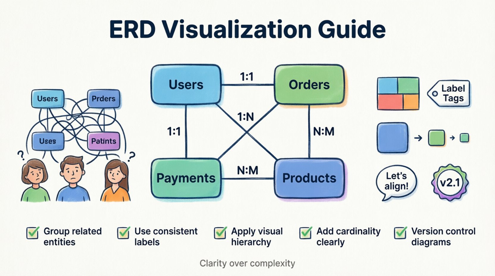
Understanding Cardinality and Relationships 🔗
Cardinality defines the numerical relationship between entities. Misinterpreting cardinality leads to incorrect database constraints. In a visual representation, these relationships must be explicit.
- One-to-One (1:1): A record in Table A links to exactly one record in Table B. Example: Employee to Badge.
- One-to-Many (1:N): A record in Table A links to multiple records in Table B. Example: Customer to Orders.
- Many-to-Many (N:M): Multiple records in Table A link to multiple records in Table B. This usually requires a junction table. Example: Students to Courses.
Normalization and Complexity Levels 📉
Highly normalized databases reduce redundancy but increase complexity for visualization. Denormalized schemas are easier to read but risk data inconsistency. Visualizations should reflect the current state of the schema while hinting at the logical intent.
- Logical Model: Focuses on business concepts and relationships without physical constraints.
- Physical Model: Includes specific data types, keys, and partitioning strategies.
- Conceptual Model: High-level overview for non-technical stakeholders.
Strategic Layout Principles 🎨
The arrangement of entities on the canvas dictates how information is processed. A chaotic layout forces the viewer to work harder to find connections. Strategic placement improves comprehension.
Grouping and Clustering 📦
Organize tables into logical clusters based on domain or functionality. This technique, often called spatial grouping, allows viewers to focus on one subsystem at a time.
- Domain-Based: Group tables by business area (e.g., Billing, User Management, Analytics).
- Functional-Based: Group tables by technical function (e.g., Authentication, Caching, Logging).
- Layer-Based: Separate core data from metadata or audit logs.
Labeling Standards 🏷️
Inconsistent naming conventions create confusion. A table named tbl_usr is harder to understand than Users. Use clear, consistent naming for entities and attributes.
- Plural Names: Use plural nouns for tables (e.g.,
Orders, notOrder). - CamelCase or SnakeCase: Stick to one convention for column names.
- Comments: Add descriptive notes to complex fields explaining specific constraints or business logic.
Visual Hierarchy 👁️
Not all entities are created equal. Primary entities should be visually distinct from supporting or audit entities. Use size, color, or border thickness to indicate importance.
- Primary Entities: Use larger boxes or distinct colors for core business objects.
- Reference Tables: Use smaller boxes or muted colors for lookup tables.
- System Tables: Use a specific style for technical tables used by the application framework.
Facilitating Cross-Team Dialogue 💬
A diagram is useless if it does not facilitate conversation. The visualization process should be collaborative, not solitary. Involve stakeholders from different disciplines during the creation and review phases.
Preparing the Context 📝
Before presenting a diagram, provide a narrative context. Explain the scope of the diagram and the specific problem it addresses.
- Define the Scope: Clarify which part of the system is being discussed.
- Set the Objective: Explain whether the goal is approval, debugging, or documentation.
- Identify the Audience: Tailor the level of technical detail to the attendees.
Conducting Review Sessions 🤝
Regular review sessions ensure the diagram remains accurate and aligned with evolving requirements. These sessions should be structured to encourage feedback.
- Walkthroughs: Lead the team through the flow of data.
- Q&A: Allocate time specifically for questions regarding relationships.
- Action Items: Document any changes agreed upon during the session.
Documenting Decisions 📜
Changes to a data model should never happen without a record. Maintaining a changelog for the diagram helps trace the evolution of the system.
- Version Control: Tag diagrams with version numbers or dates.
- Change Logs: Record who made the change, when, and why.
- Impact Analysis: Note which systems or teams will be affected by the change.
Managing Evolution and Versioning 🔄
Schemas are living artifacts. They change as requirements evolve. Managing this evolution requires discipline to prevent the diagram from becoming outdated.
Change Control 🔒
Implement a process for modifying the diagram. Unauthorized changes lead to drift between the documentation and the actual implementation.
- Review Board: Require approval from lead architects for schema changes.
- Integration: Ensure diagram updates happen alongside code changes.
- Notifications: Alert relevant teams when critical entities are modified.
Deprecation Strategies 🗑️
Old tables and columns must be retired properly. Visualizing deprecated items helps teams avoid referencing obsolete data.
- Visual Strikethrough: Mark deprecated entities with a clear visual indicator.
- Separate Zones: Keep deprecated items in a separate section to avoid confusion.
- Migration Paths: Show the relationship between old and new structures.
Common Pitfalls to Avoid ⚠️
Even experienced architects make mistakes when visualizing data. Being aware of common traps helps maintain diagram integrity.
| Pitfall | Impact | Mitigation |
|---|---|---|
| Over-Engineering | Diagram becomes too complex to read | Abstract details not relevant to the current discussion. |
| Ambiguous Labels | Stakeholders interpret data differently | Define a glossary for all table and column names. |
| Cross-Coupling | High dependency between unrelated modules | Refactor to separate concerns into distinct clusters. |
| Missing Metadata | Technical constraints are hidden | Include constraints like nullable, unique, or default values. |
| Outdated Views | Teams build against old schemas | Automate synchronization between code and diagram. |
A Practical Checklist for Review ✅
Before sharing a diagram with the wider team, run through this checklist to ensure it meets alignment standards.
- Clarity: Can a non-technical stakeholder understand the core entities?
- Consistency: Are naming conventions applied uniformly throughout?
- Accuracy: Does the diagram match the actual database structure?
- Completeness: Are all critical relationships and foreign keys represented?
- Readability: Is the layout logical and free of crossing lines where possible?
- Accessibility: Can the diagram be viewed and annotated by all team members?
- Context: Is there accompanying documentation explaining the business logic?
- Version: Is the version number clearly visible on the diagram?
Final Thoughts on Data Communication 🌟
Effective visualization of Entity Relationship Diagrams is a critical skill for modern technical leadership. It requires balancing technical precision with communicative clarity. By adhering to structured layout principles and fostering open dialogue, teams can ensure that data models serve as a foundation for collaboration rather than a source of conflict. The effort invested in clear documentation pays dividends in reduced errors and faster development cycles. Moving forward, treat the ERD not just as a technical drawing, but as a strategic asset for organizational alignment. 🚀
Remember that the goal is understanding. When every team member—from the product manager to the database administrator—shares the same mental model of the data, the entire organization moves more efficiently. Continuous refinement of these diagrams ensures they remain relevant as the system grows. Prioritize clarity over complexity, and always validate the visual representation against the source truth.